
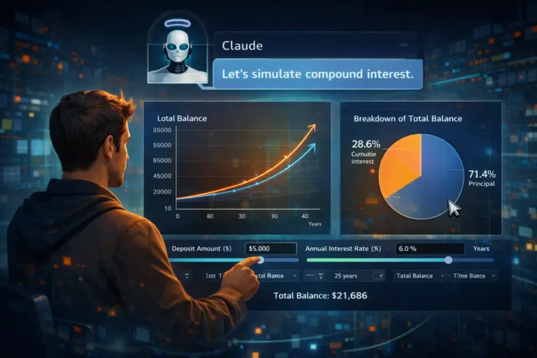
Anthropic has taken a further step by giving Claude the ability to generate interactive charts, diagrams and visualisations directly inside conversations. The feature changes things for professionals who need to turn raw data into usable visuals quickly, without opening Excel, without installing a plugin, without writing a single line of code.
Not an image, a genuinely workable chart
The fundamental distinction is interactivity. When Claude generates a chart, it is not a frozen screenshot: it is an interactive component you can manipulate, modify and develop as the discussion goes on.
Take a concrete example. You ask Claude to build a compound interest simulator. Within seconds you get a working tool with sliders for the initial capital, the interest rate and the term. No advertising, no cookie banners, no sign-up on a third-party site. The tool is right there, in your conversation, ready to use.
What makes the approach powerful is that it is iterative. You can tell Claude: "Add a curve to compare with a 3% rate" or "Switch the vertical axis to a logarithmic scale". The chart updates instantly. That is visual prototyping in real time.
The race for AI visualisation
Anthropic is not alone on this ground. The three big generative AI players are competing on visualisation capability:
- OpenAI: has introduced "Dynamic visual explanations" in ChatGPT, oriented mainly towards mathematics and science. The visualisations are pedagogical and animated, designed to explain complex concepts step by step.
- Google: offers interactive charts in Gemini Advanced, but the feature stays reserved for the premium subscription at $200 a month, a price that excludes most small businesses and independents.
- Anthropic: makes the feature freely available to all users, including those on the free plan. That is a strong strategic choice which widens access to AI data visualisation.
This difference in pricing matters. For the head of a small business wanting to visualise sales data, or a consultant preparing a client presentation, free access removes a significant barrier.
Concrete applications for professionals
Beyond the technological novelty, the professional use cases are numerous:
- Dashboards from raw data: paste a table of figures into the conversation, ask for a chart, done. No more formatting data for a business intelligence tool.
- Visualising trends for decisions: compare scenarios, project growth curves, model budget assumptions. The AI generates the visuals, you keep control of the interpretation.
- Infographics for presentations: generate clean, professional charts in seconds for your slides, reports or proposals.
- Teaching tools: build interactive simulators to train your teams or explain a concept to a client. A return-on-investment simulator, a cloud versus local cost calculator, a projection of productivity gains.
- Exploring data: when you receive a CSV export from your CRM or your accounts, ask Claude to "show the trends". Visualisation often reveals patterns invisible in a table of figures.
The limits to know about
The feature is still in beta. Charts can contain calculation errors or visual inconsistencies. It is essential to check the underlying data before using an AI-generated visual in a professional context. The AI proposes, the human verifies and approves; that is the "human in the middle" principle we apply consistently at AS3P.
Generated charts also do not replace a dedicated BI tool for recurring needs or large data volumes. They do excel at rapid prototyping, one-off exploration and visual communication.
The multi-provider approach: the right tool for each task
This advance illustrates a fundamental principle of our approach: there is no "best AI". Each tool excels in its own domain. Claude is particularly strong at writing and analysing long documents. ChatGPT dominates on structured data processing. Gemini shines at web research and integration with the Google ecosystem.
The real skill is not mastering a single tool, but knowing which one to use for each task. That is exactly what we teach in our TNT training: a pragmatic, results-oriented multi-provider approach.
With interactive charts, Claude adds a string to its bow. For professionals who already master prompting and structuring requests, it is an immediate productivity gain. For everyone else, it is one more reason to get trained.
Source: The New Stack.